THEATR SEATR
UX & UI Design
Theater Seater is an app that allows users to purchase movie tickets and treats on-the-go. It provides a simple, intuitive and efficient user-flow, making the movie-going experience contactless and, of course, fun!
- Lead Designer
- Branding
- Responsive Design
- Information Architecture
- Accounting for Accessibility
- Low and High Fidelity Prototyping
8 Months
- Figma
- Canva
- Google Suite
Moviegoers often seek a streamlined way to plan their experience in advance — from selecting seats to purchasing tickets and concessions — while avoiding long lines. Existing ticketing apps are often generic, failing to cater specifically to the movie industry or include independent theaters. Additionally, many overlook key features like concession ordering and the ability to share reservations with friends.
Create a user-friendly app that simplifies movie planning — from seat selection and ticketing to concession ordering and sharing reservations — with support for independent theaters and a seamless user experience.
PRIMARY + SECONDARY RESEARCH
SECONDARY
The COVID-19 pandemic has, and will continue to, impact consumer behavior. Trends like online ordering, distanced commerce, and investment in digital strategies are projected to become even more frequently used as technology continues to advance.
There was already a rise of online ticket sales before the pandemic and this trend has only compounded with COVID-19.
Customer pain points for buying movie tickets at the theater included:
Waiting in line
Limited seat selection at time of purchase
Inability to purchase refreshments ahead of time
Lack of contactless options
Limiting human exposure and creating contactless opportunites help prevent the spread of the COVID-19 virus, therefore, creating an app that depleats the need for these practices is necessary and crucial.
According to a market research done by Vertigo, online purchasers were 2.1x more likely to buy concessions and (where applicable) 1.7x more likely to buy a meal compared to the at-theater ticket purchasers. In 2018, the study witnessed a 44% increase of moviegoers who bought online that watched films on a 2D premium screen format. 3D, Premium 3D, and IMAX also saw more moviegoers who purchased online.
Comfort, which would include the type of seating, and reserved seating became major factors when selecting a theater to online ticket buyers. 28% of online ticket shoppers said they picked the theater because of reserved seating, while only 7.6% of those who bought at the theater listed that as a reason. 36% of moviegoers surveyed picked their theater because of comfort, compared to only 25.9% of offline buyers.
As the notion of moviegoing as an impulse choice or a spur-of-the-moment casual entertainment option declines in popularity, it is expected that we see a larger percentage of tickets reflected in online sales and reflected in premium offerings (IMAX, 3-D, Dolby Cinema, D-Box and general high-end multiplexes).
PRIMARY
Surveys
I conducted a survey and recieved 10 respondents. The goal of the survey was to uncover the user pain points and motivators during the movie-going and ticket/concession purchasing experience. I also wanted to uncover consumer preferences in regards to seat selection, concession ordering habits, and their experience with existing online movie ticket purchasing apps.
Motivators
Over half of the participants considered seat selection when purchasing a movie ticket.
About 75% of participants considered location and proximity to a theater as a top priority.
Quality design (easily accessible information, aesthetics, navigation, flow) improves user perception and experience.
Most users like a“continue as a guest” option when checking out.
Almost all users would sign up as a member of an app to buy their movie tickets and concessions online if promos or deals were offered.
85% of the users surveyed plan their trip to the movie theater rather than it being a spur-of-the-moment decision and order their tickets online.
About 30% of users consider a contactless experience when going to the theater.
Pain Points
Long lines and waits for ticket and concessions purchasing
Inability to reserve seating (especially for larger parties trying to sit together)
Cluttered and unappealing websites / apps.
Forced to sign-up / sign-in.
Difficulty finding important information.
Clunky checkout processes.
Lack of app and website with concession ordering options.
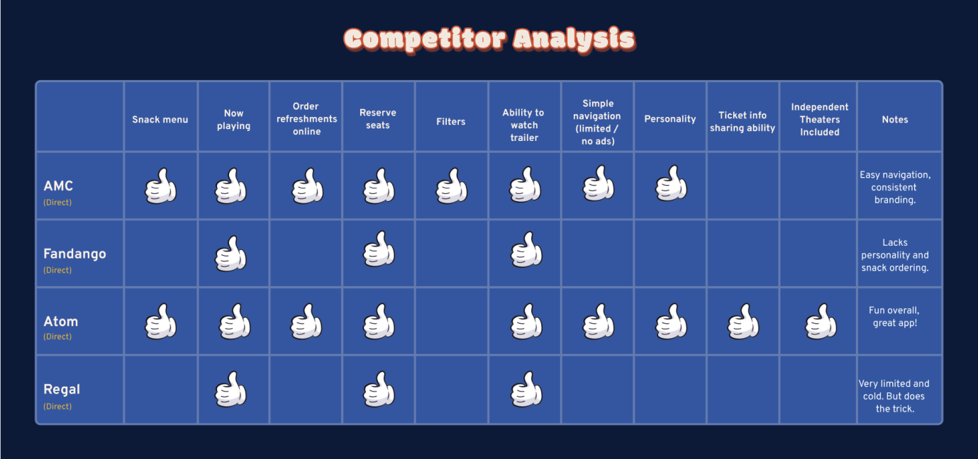
I conducted a competitor analysis to see where other movie ticket apps could use improvement and noticed that very few existing apps include a filter page to make movie searching more efficient, and they also rarely include the ability to share the movie / reservation with friends. Lastly, many existing movie ticketing apps are produced by the theater they represent, or similar to larger companies such as Fandango (a third party), they do not include independent theaters in their nearby theater options.
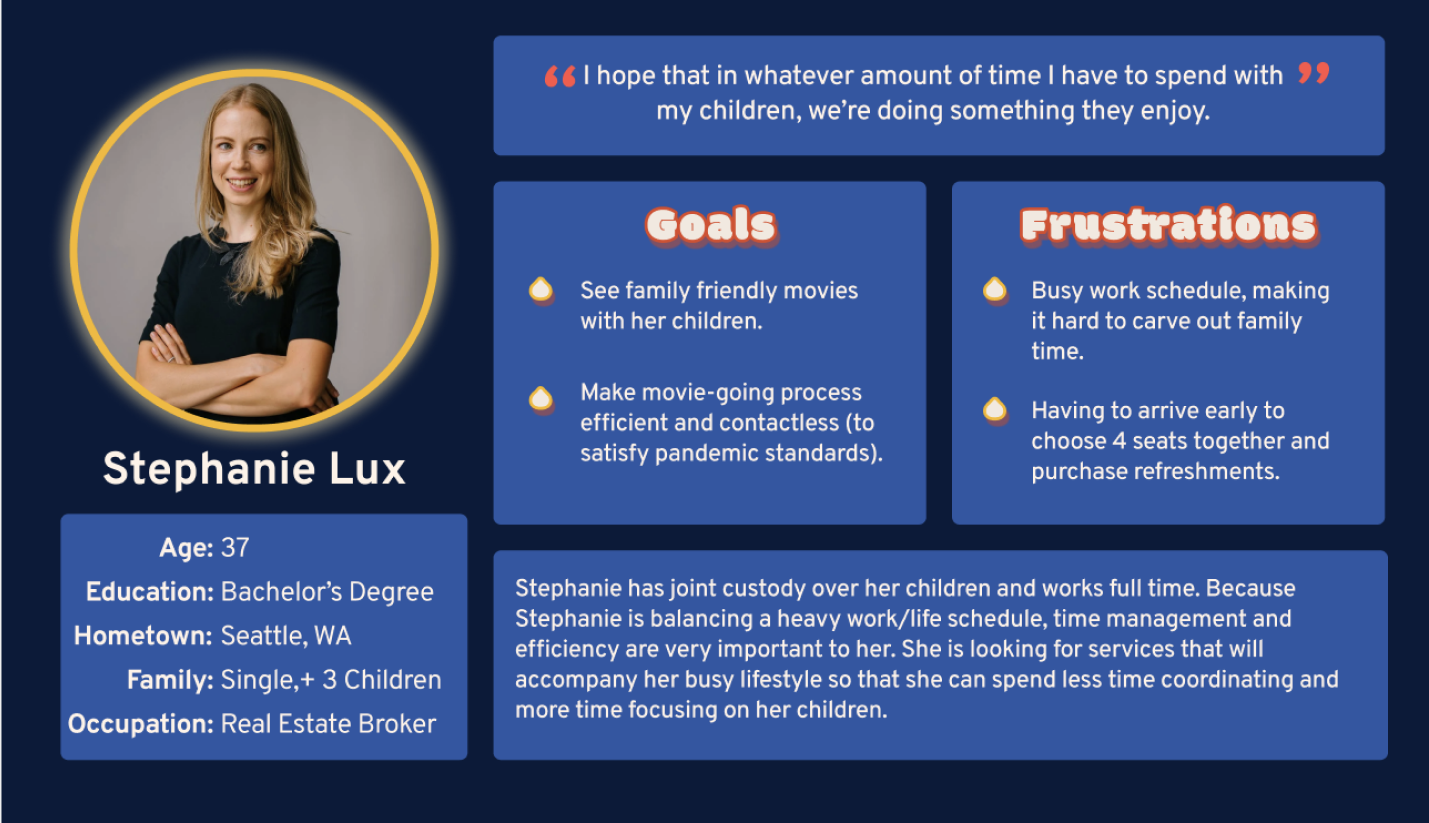
I also created a user persona to represent a group of users and to keep their goals and frustrations in mind while moving forward in the design process.
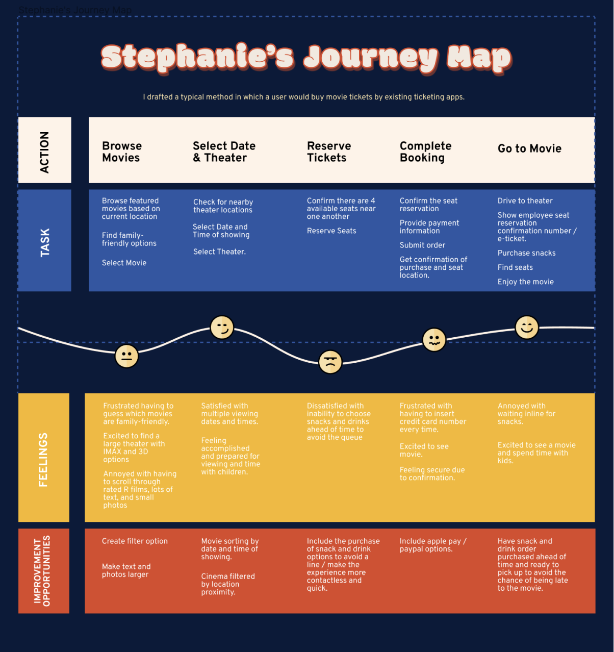
I created a journey map to better understand Stephanie’s thoughts, feelings, and frustrations during a typical online movie ticket purchasing experience. This helped me gain insights into common customer pain points and how to improve them.
IA + INTERACTION DESIGN
SITE MAP
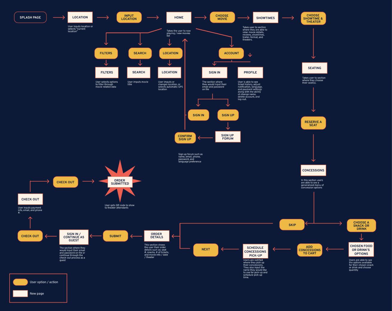
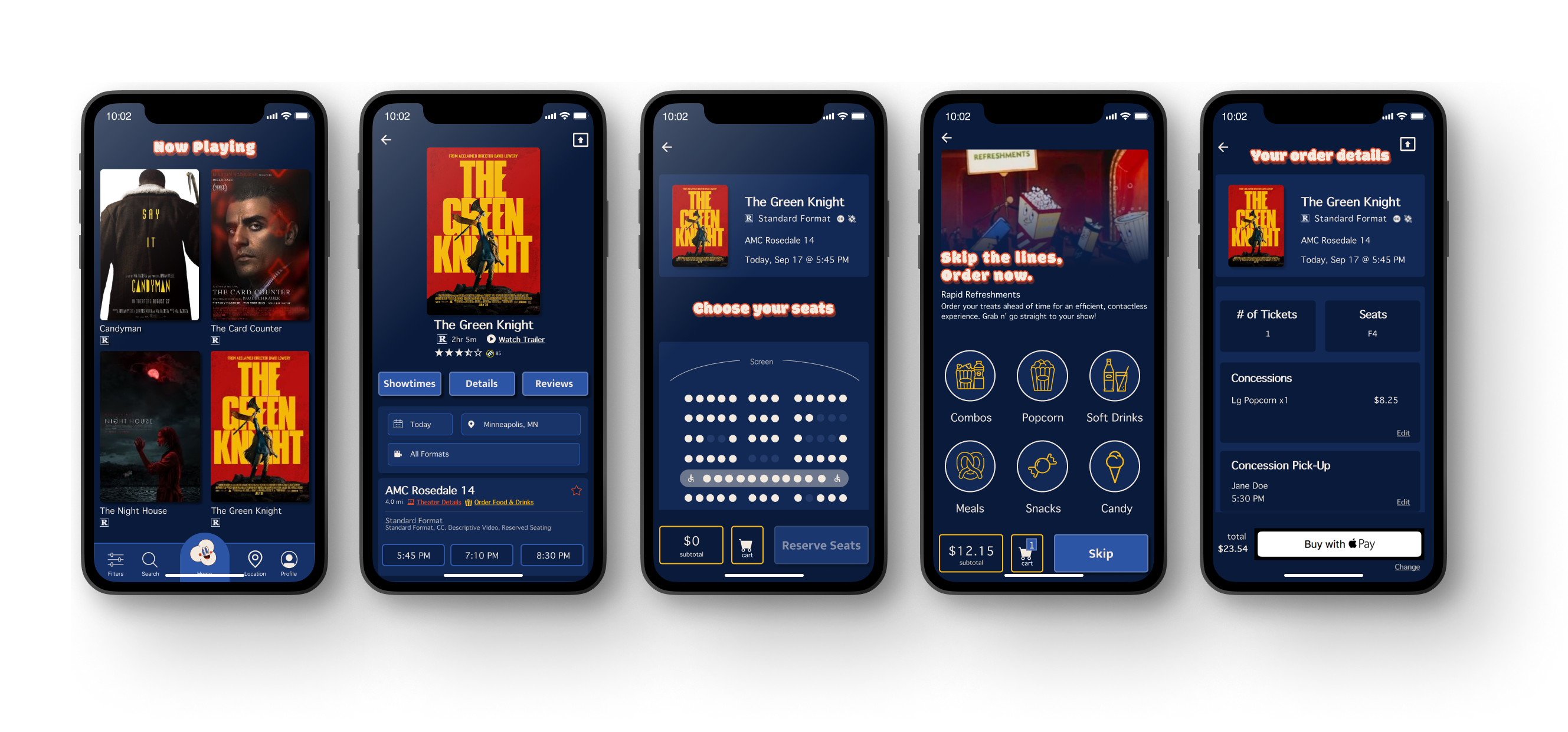
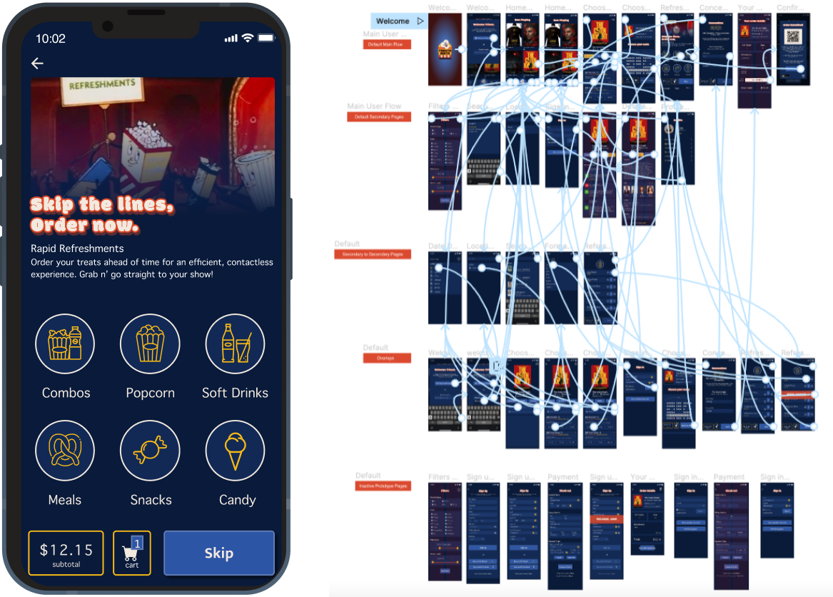
I created a sitemap to provide an overview of the designed information architecture. From the home screen, which duals as the screen that displays the new releases / now playing in theaters films - the user has five options or actions that they can take (highlighted in yellow). From here there are six different pages they can land on (highlighted in white). By choosing a movie from the home screen, the user is then taken into a sequential userflow that directs them to choose a theater nearby, pick a showtime, reserve seats, order concessions (or skip them), then leads them to the checkout flow. The user also has the ability to go back to the previous page at anytime throughout this flow, if desired.
The main userflow is primarly laid out sequentially, similar to many of the existing ticket purchasing apps. I decided to stick to this trend because it prevents the ticket and concession buying experience from offering too many options, which can often lead to an overwhelming user experience. It encourages the use of the apps navigation, and increases conversion rates while limiting the drop-off rate.
Based on research that suggests account creation can improve customer retention, I chose to include the option to both continue as a guest and the ability to sign-in or sign-up at the very front of this flow (under the account tab), and at the very end of this flow (during the checkout process).
WIREFRAMING
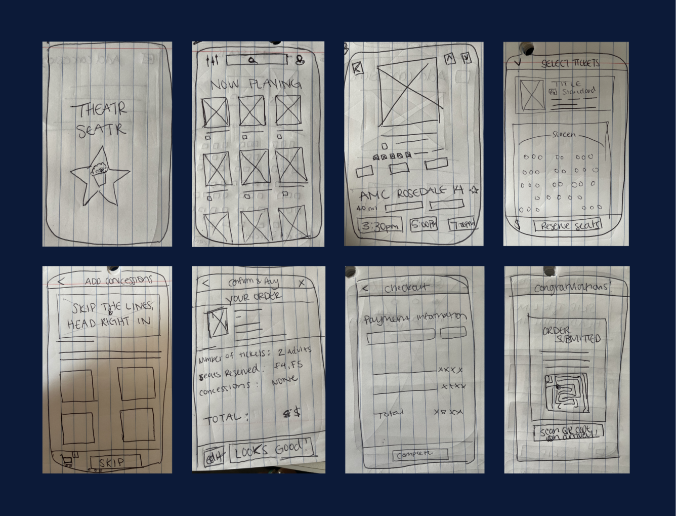
Above are some hand-drawn wireframes that I slapped together early on in the process to represent a very bare-bones, main userflow. To set the app apart from existing movie-ticketing apps, I ensured that it included filters, concessions, and the ability for users to choose their seats.
The user starts at a splash page that welcomes them to the app, then it lightly fades into a screen that asks them for their preferred location, once they choose their location, they are directed to the Home / Now Playing page. From there the user has three options to narrow their search for a movie. These options are in the form of CTA's. They include choosing a location, filtering information, and the ability to search the exact movie they're looking for. By choosing a movie, the user will automatically be led into a checkout flow. They are able to travel through the flow in reverse as well in case the user makes a mistake or has a change of heart in their movie, seat, concession, or payment selections.
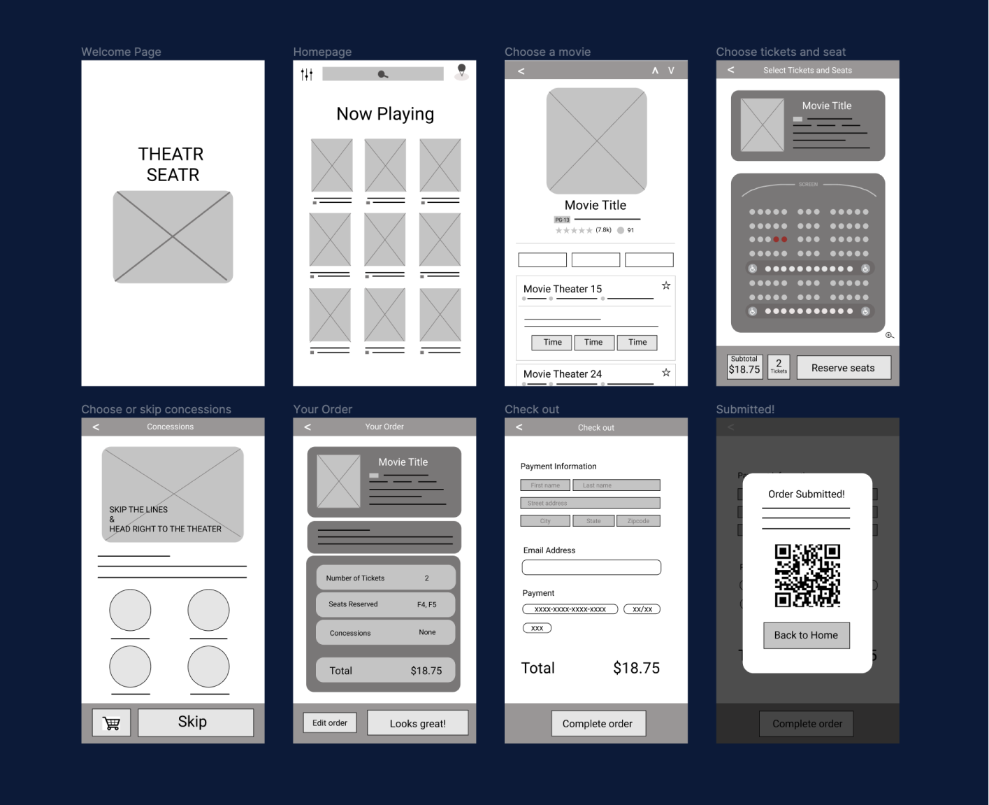
Satisfied with the rough sketches of the app, I decided to turn them into digital wireframes. This provided me with a more accurate representation of what the app will actually roughly look and feel like. The userflow of this app considers most of the apsects that are important to it’s users: seat selection, pre-ordering concessions, and a straight forward checkout process. However, I ended up changing a few things in the mock-up stage of my design process, as you can see on the testing and iterations page.
UI + BRANDING
LOGO DESIGN
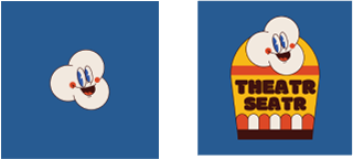
Most existing movie ticketing apps are impersonable and have a cold, corporate feeling. To warm it up a bit, I gave Theatr Seatr a personality to make it more visually exciting and inviting to the user by incorporating 1930’s american rubberhose cartoons. This design is both simple and endearing.
TYPOGRAPHY + COLOR PALLETE
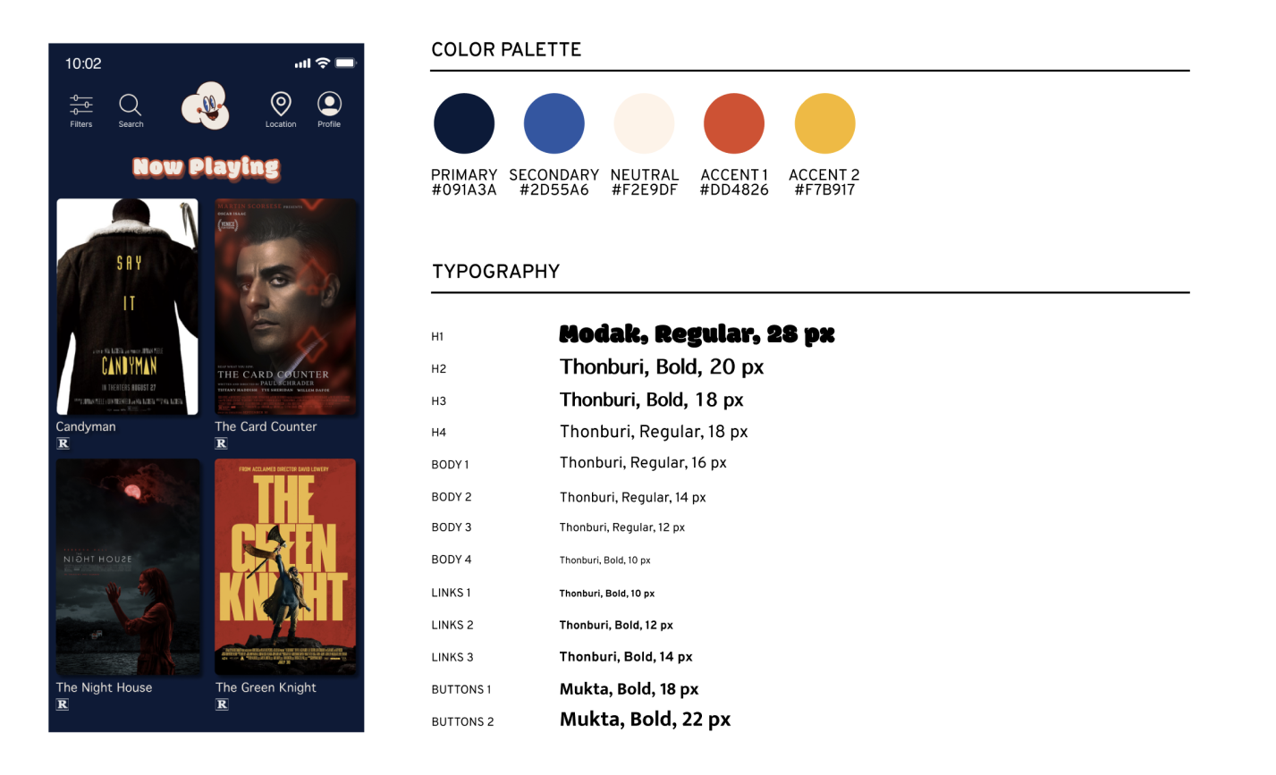
My typography and UI kit is also inspired by vintage elements. I chose Modak, a decorative font, as the header for each page to compliment the rubberhose cartoon aesthetic. I paired it with Thonburi, a simple sans-serif font, to prevent the user interface from being overwhelming and difficult to read. I also chose to differentiate between the text on each page and the text of the buttons. This helps draw the eye to the buttons and prevents confusion as to where the user is able to click. I use Mutka for the CTA’s, another basic sans-serif font that offered a stronger bold option.
MOOD BOARD
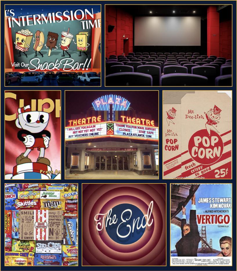
While trying to choose an aesthetic, I conducted a “vintage movie theater” google search and found some of the pictures that gave me inspiration for both my color palette and the overall retro feel.
UI KIT
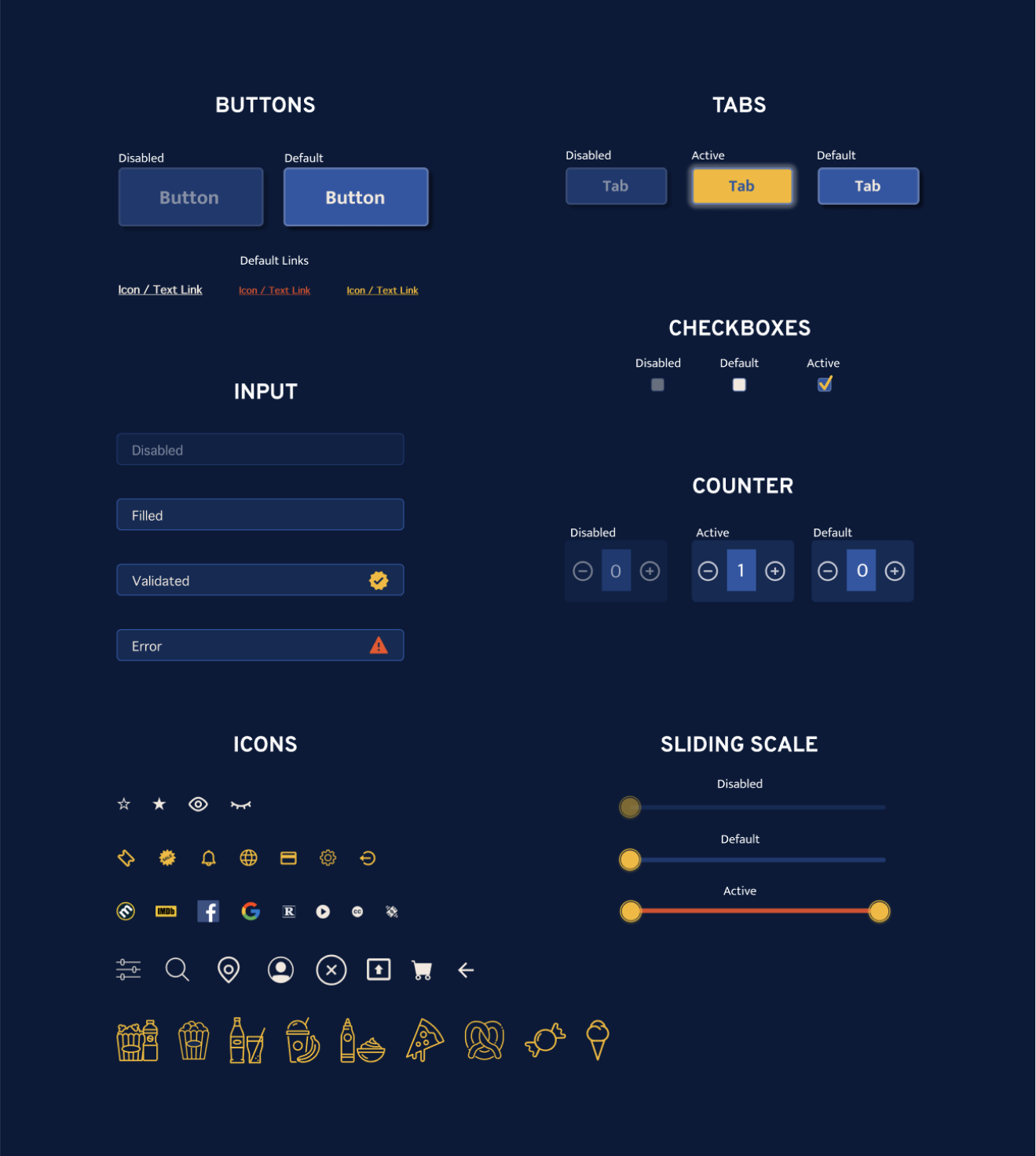
To create a UI Kit, I compiled a list of all the UI elements that I would need to design for the Theatr Seatr app and stylized each one of them. The UI kit gives a clear guide on how to treat each component’s states.
Creating the UI kit, I decided to stick with the original color palette to keep the design consistent, intuitive, and accessible.
TESTING + ITERATIONS
HIGH FIDELITY PROTOTYPES
After applying my style guide and UI kit to the wireframes, I finished the userflow by adding all the important features and their supporting pages.
The prototype demonstrates the user experience throughout the entire site. I organized the flows by their states, heirarchy, and by how they will be used in the prototype phase, such as “default”, “secondary pages”, “active”, and “overlays”.
USABILITY TESTS
Using my prototype, I conducted usability tests to see how successful my design was. I launched this test with Maze and recieved 45 participants over a three day period. The goal of this usability test was to learn how to conduct one properly (it was my first time!), and more importantly to uncover how usable, ituitive, and discoverable the design was.
I was specifically interested in examining the success of online ticketing, concession ordering, and seat selection flows. According to users, these are the most important aspects of an online ticketing app.
USABILITY TEST #1
I presented participants with the following tasks:
I presented participants with the From the home screen (or Now Playing screen), please search for a movie.
From the home screen (or Now Playing screen), please sign up for a Theatr Seatr account.
From the home screen (or Now Playing screen), please reserve a seat and purchase a movie ticket.
Because participants had issues reserving a seat, they could not purchase a ticket. This was due to my own misunderstanding of the Maze app at the time.
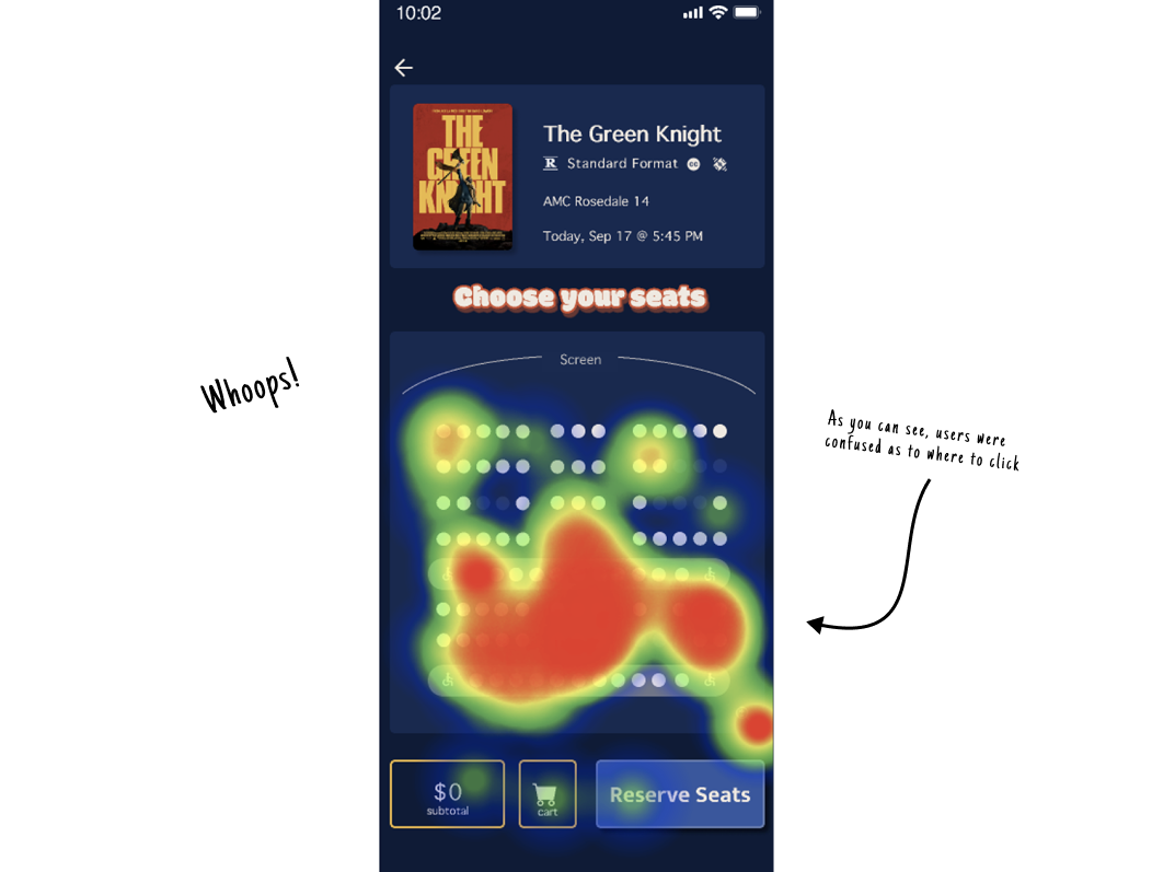
As you can see from the heat map, users had a tough time finding which seat was available for clicking, making the drop off rate higher than expected. Using what I learned from my (very) first usability test, I made some prototype iterations and conducted another usability test with more detailed instructions.
Although I experienced a setback, the usability test validated the majority of my designs decisions.
FURTHER QUESTIONS
Once the participants completed the tasks, I asked them to respond to the following questions:
How legible did you find the color palette?
Were there any aspects of the design / flow that you particularly liked or enoyed?
Were there any aspects of the design / flow that you particularly disliked or found frustrating?
Any additional questions (N/A if you’d rather not participate)
Almost all users found the color palette very legible and representative of a movie theater feel. Many participants noticed the prototype issue and brought it to my attention. One user suggested a key to distinguish which seats were available, taken, and selected by the user. I took this into consideration in my iterations going forward.
ITERATIONS #1
After the feedback I received, I went into my design and made the entire theater layout clickable. I updated my research questions to make them more specific, while keeping them vague enough to avoid dictating the results.
USABILITY #2
I launched this usability test also with Maze and recieved 13 participants over 2 days.
This usability test showed a 93% success rate for the first task: looking over movie details. Signing up for a Theatr Seatr account also deemed successful with 80% of participants having no trouble with the task, but saw only a 60% success rate (both directly and indirectly) for the last and most important task: purchasing a ticket. The drop off rate improved in this task between the two tests, however, they were still not up to where I wanted them to be.
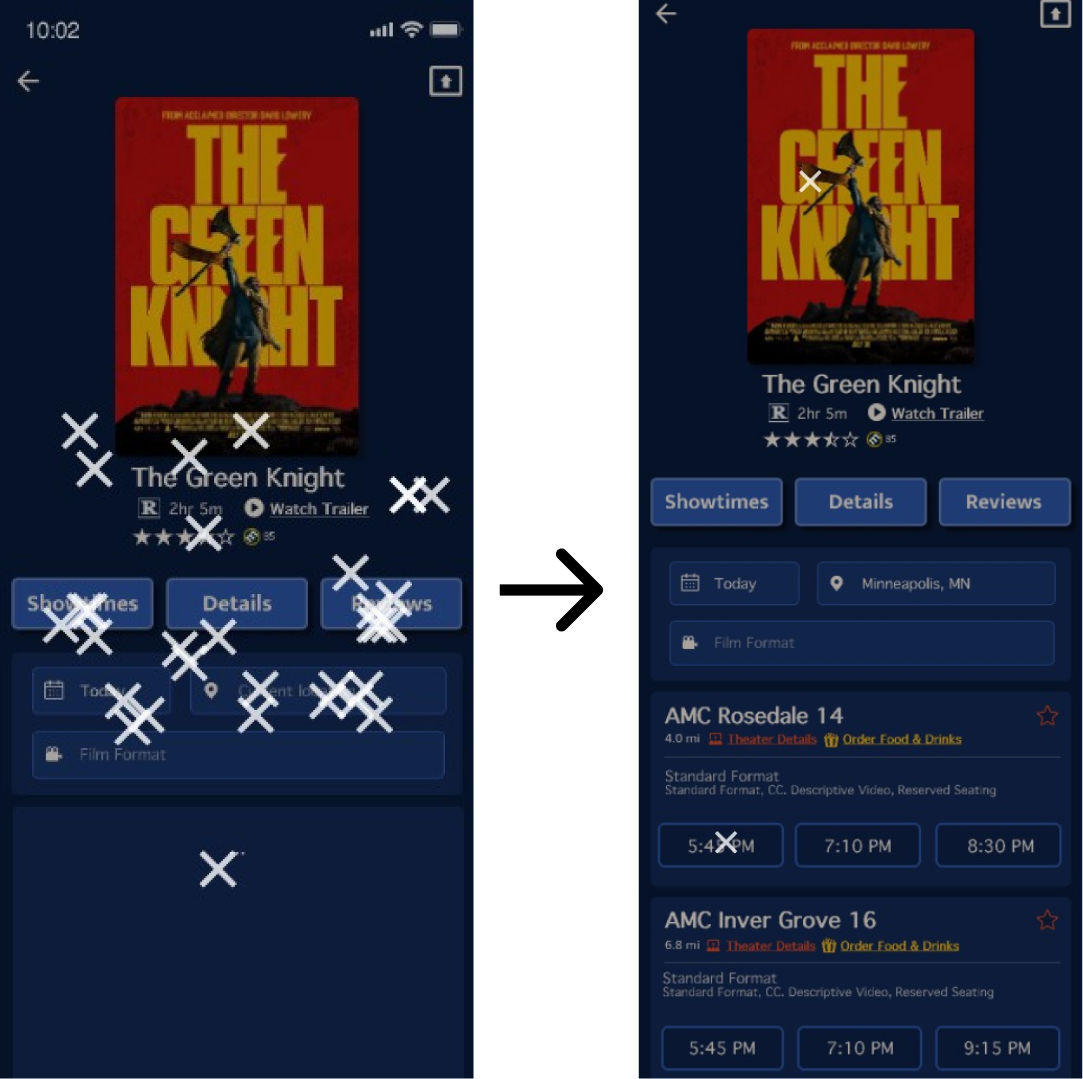
The participants were having issues on the showtimes page (indicated by the pictures of the participants taps), an area in my design that hadn’t shown any issues in the previous test and a screen in which I hadn’t made any design changes.
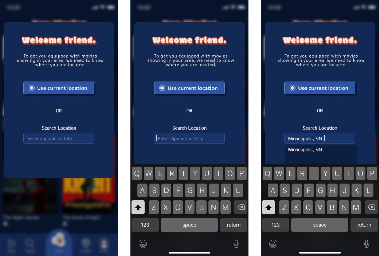
A couple of participant's mentioned at the end of the usability test that it was unclear to them that they were required to input their location and date in order to see the theaters and showtimes available to them. To avoid this problem in the future, I will ask the users in the beginning of the flow to choose their location and the app will autofill to “today's date”.
One participant stated that they were frustrated with the location of the navigation bar (at the top of the screen), and that it made it hard to reach. I plan to move the navigation bar to the bottom to make it more accessible.
ITERATIONS #2
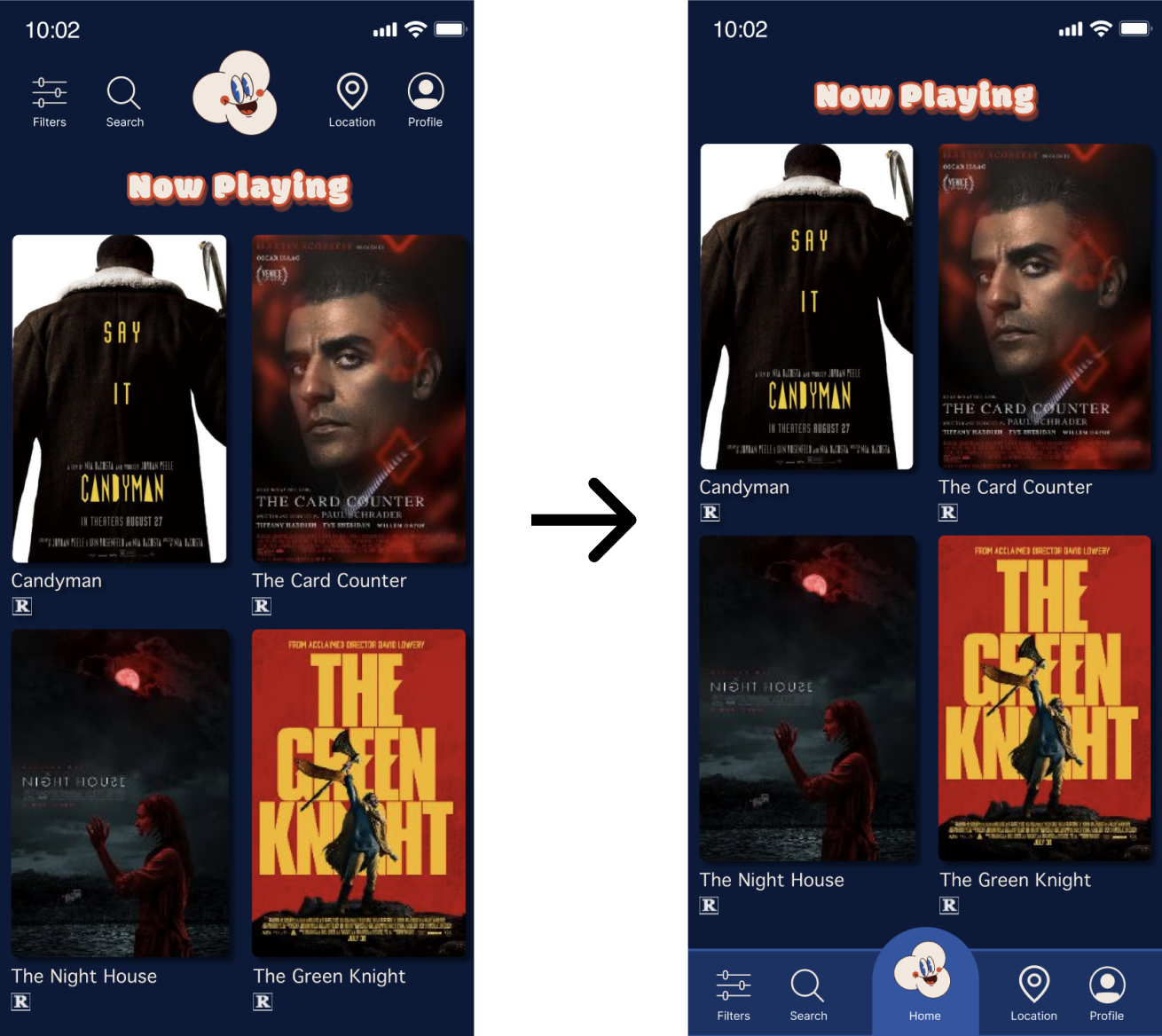
I adjusted the navigation bar by placing it at the bottom of the screen so that it is more accessible. To avoid confusion on the showtimes page, I took the participants feedback and require the user to choose their location earlier in the userflow. The screens portray the change in position of the navigation bar from the top of the screen down to the bottom.
The screens below show that I adjusted the location input screen from the middle of the flow to the beginning, making it less confusing later in the flow for the user to find the available theaters and showtimes in their area.